- CellxGene
- Find Published Data
- Contribute and Publish Data
- Download Published Data
- Analyze Public Data
- Get Started
- Hosted Tutorials
- Gene Expression Documentation
- Annotate and Analyze Your Data
- Join the CellxGene User Community
- Cite cellxgene in your publications
- Frequently Asked Questions
- Learn About Single Cell Data Analysis
Gene Expression — Query Gene Expression Across Tissues
Gene Expression is a tool that allows users to query the expression of any gene across all data in CELLxGENE Discover. A query results in a dot plot per tissue as explained below.
How to Interpret a Gene Expression Dot Plot
Dot Plot Basics
A dot plot can reveal gross differences in expression patterns across cell types and highlights genes that are moderately or highly expressed in certain cell types.
Dot plots visualize values across two dimensions: color and size (Figure 1). The color of the dot approximates average gene expression. Its size represents the percentage of cells within each cell type that expresses the gene.
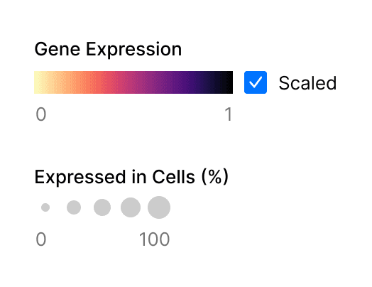
Figure 1. Two metrics are represented in gene expression dot plots, gene expression and percentage of expressing cells.
The combination of these metrics in a grid of genes by cell types enables you to assess gene expression (Figure 2).
Be aware that genes that are lowly expressed or expressed in a small percentage of cells may be difficult to visually identify in a dot plot. This is particularly important for certain marker genes which are specifically but lowly expressed in their target cell types, for example transcription factors and cell-surface receptors.
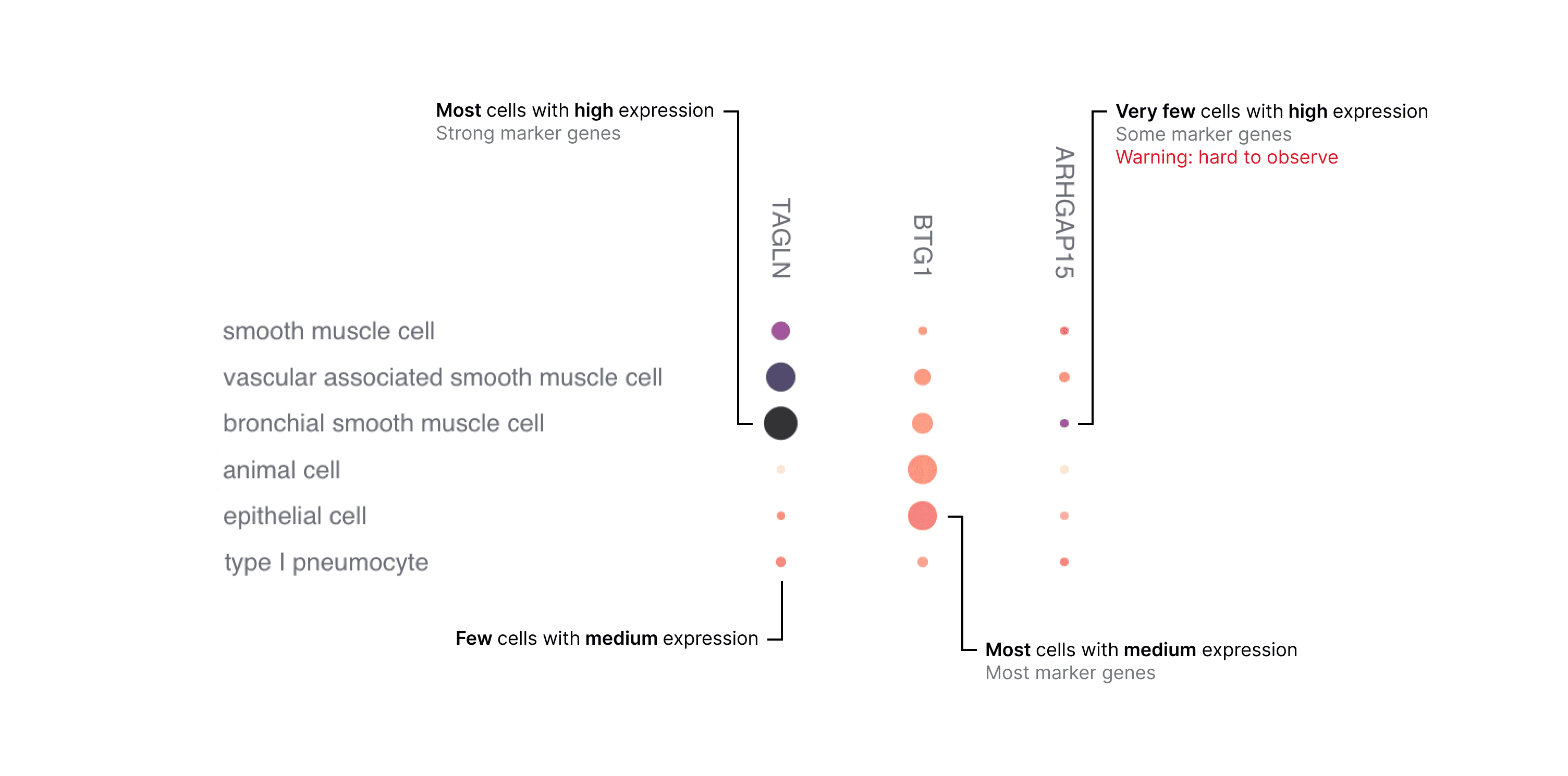
Figure 2. Example of how to interpret the dot plot.
How to Make Sense of Normalized Values
The data used to create the dot plot is normalized with a log transformation of scaled pseudocounts (ln(CPTT+1)) and then averaged (see "Gene Expression Data Processing" section for details).
There are two color scales available: scaled and unscaled. The unscaled color map is fixed to a minimum value of 0 and a maximum value of 8; these are comparable across dot plots. The scaled color map is responsive to the data currently in view, and assigns the minimum value in view to 0 and the maximum value in view to 1; these are not comparable across dot plots.
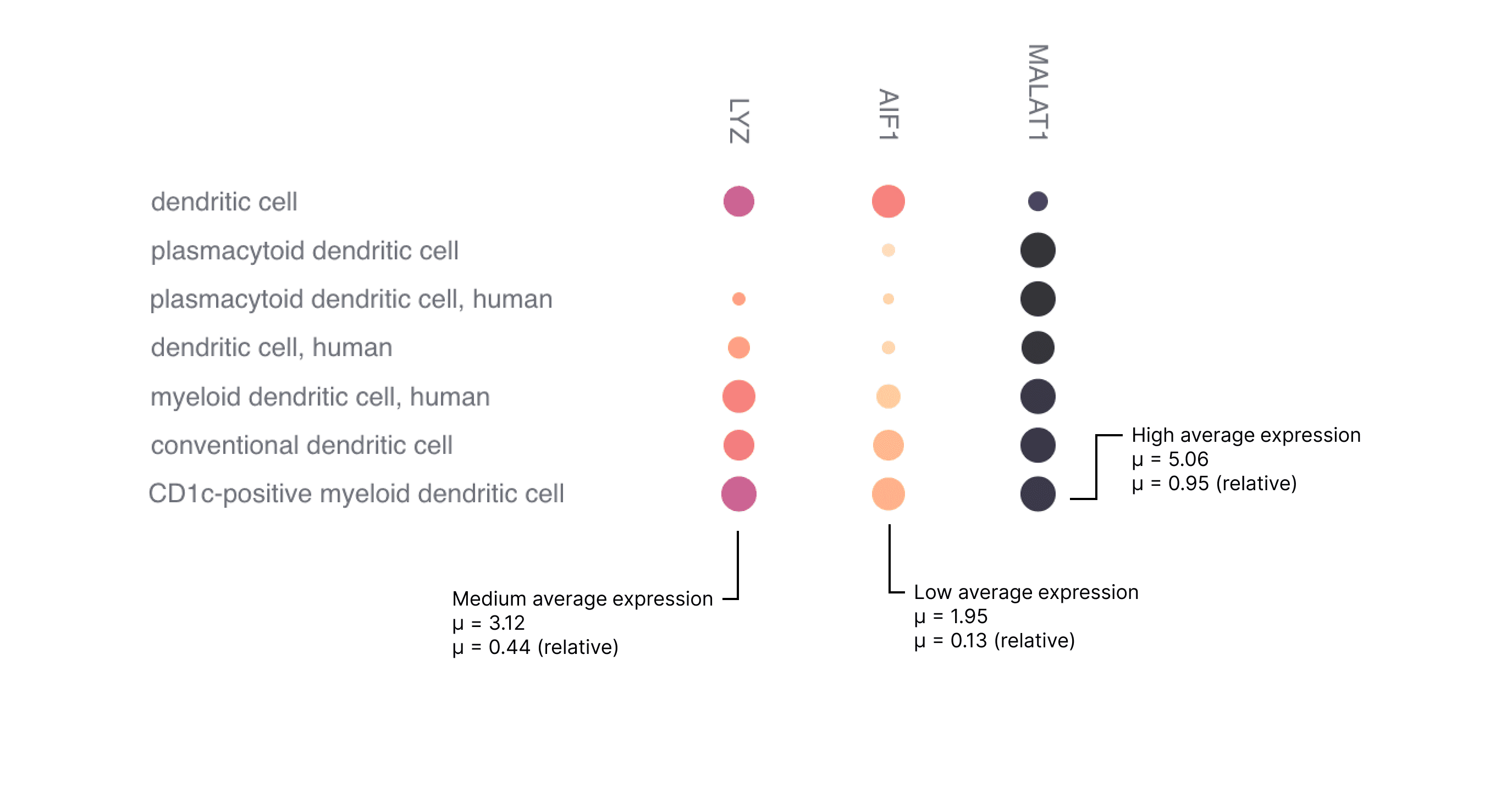
Figure 3. Examples of high, medium and low expression.
The examples in Figure 3 have a relatively constant percentage of cells expressing a gene (dot size), however to identify highly expressed genes the user is advised to pay attention to both the color intensity and the size of the dot.
How to Navigate Cell Types
Cell types in the dot plot (rows) are ordered by default with a heuristic algorithm that tries to preserve relationships in the Cell Type ontology (CL).
The expressions and cell counts of parent cell type terms are supersets of child terms. In other words, the expression of a gene in a parent cell type includes the expression of that gene in all its descendant cell types.
Caveats of Normalization
Given that the data are normalized and concatenated, but not integrated, there may still be significant batch effects present in this data. While normalization and aggregation (taking the mean expression across many cells) somewhat mitigates these artifacts, caution is advised when examining subtle differences in the dot plot across cell types. See our manuscript for a detailed analysis.
Users interested in evaluating the pre-normalized absolute expression data can access it through our CELLxGENE census API.